

When Art Walks Off the Wall and Onto Your Back: The Blake Mill x Lowry Evening
There's something quietly radical about standing in a gallery full of Lowry originals whilst wearing a shirt covered in the very same matchstick figures staring back at you from the walls. Art, conversation, impeccable shirts, and a few things about Lowry himself that most people never know.
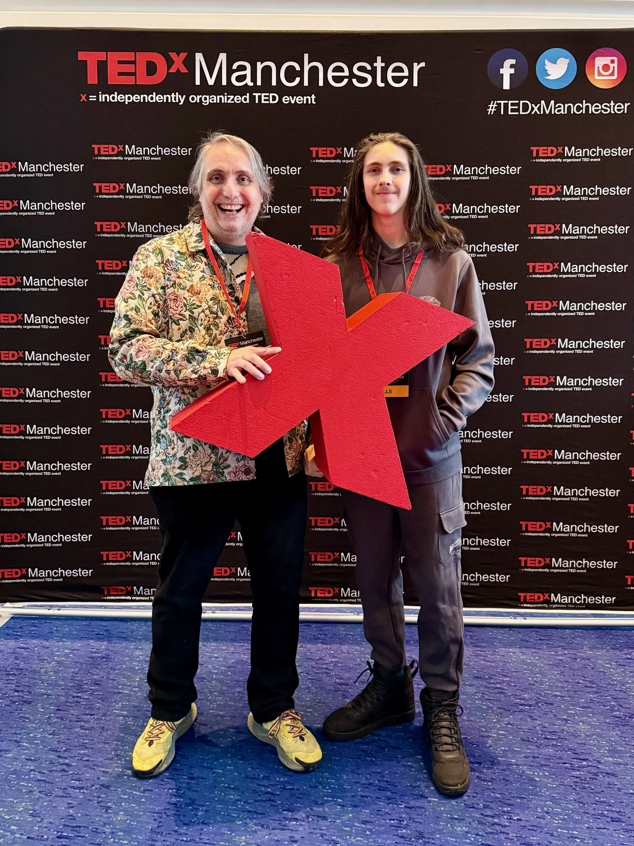
What TEDx Manchester Taught Me About Listening, Living, and Letting Go of Your To-Do List
TEDx Manchester 2026 at the Bridgewater Hall — seven hours, ten speakers, one very large stage. Here are the five talks that landed hardest, and what they mean for how we work, think, and pay attention.
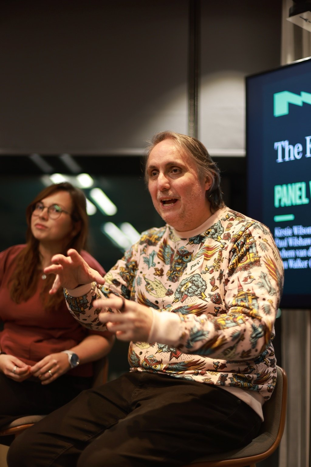
What Does the Future of Experience Actually Look Like? Here's What Four Experts Said at PwC
We talked about big things. Some of us gestured a lot. And apparently I said something about glitter and turds that made it into the official Natter write-up, which feels like a personal milestone. Here's what actually came out of it.

Merry Christmas, Happy Holidays and a bright 2026
As the year wraps up, we wanted to say a big, genuine thank you for all your support. Whether you have worked with us, cheered us on, challenged our thinking or simply believed in what we are building, thank you for being part of our story so far.
Can Gemini 3 speed up UI design without losing quality? (Yes it can)
Gemini 3 can speed up UX and UI design without losing quality. This practical guide shows five ways to use it: wireframing, design system tokens and variables, UI to code, consistent visuals, and quick accessibility audits. Copy the prompts, ship useful artefacts, and stay inclusive.

How do you ‘Make’ like a pro with Figma Make for smarter AI-powered prototyping?
Power up Figma Make with prompts that read like a brief, frames that act like systems, and tight constraints. Use the 10 minute Make loop, Prompt DNA and a token bridge to keep prototypes fast, accessible and on brand. Less rework, sharper demos, more time for human craft.

Intuitive interfaces: what actually makes them clear?
Most “intuitive” interfaces are just clear. This article shows how to remove cognitive load with precise language, predictable structure, and visible feedback. Use the clarity trifecta and the 3–30 ladder, run the five-second test, and fix mobile-first friction that costs sign-ups and sales.

Why should designers care about Tailwind and Shadcn in the AI era?
Tailwind and Shadcn help designers and engineers move from ideas to accessible, consistent interfaces at speed, especially in an AI workflow.

Launching our Sustainability Strategy and Roadmap
We want to design for a Net Zero planet. We are proud to share our brand new Sustainability Strategy and Roadmap with you. Read the blog to find out more.

Designed for Humans joins the DiSH Accelerator to scale sustainable, human-centred innovation
We’re thrilled to share that Designed for Humans has been selected to join the DiSH Accelerator programme.
Being selected for the programme marks an exciting step forward for us as we continue to expand our work in sustainable, inclusive and ethical digital design. Read the blog to find out what this means for Designed for Humans.

How are you inspiring the next generation of women?
Today (08/10/25) is Ada Lovelace Day, an international celebration of the achievements of women in science, technology, engineering and maths (STEM). Read the blog to find out why it is important to consider what we can all do to inspire the next generation of women into STEM.

Inclusive by design: Supporting Dyslexia Awareness Week 2025
Accessibility is at the heart of our business and to support Dyslexia Awareness Week 2025 we’ve created a free accessibility guide to make it easier for dyslexic people to navigate your website.

Growing with purpose: Welcoming Tiff and our sustainability journey
At Designed for Humans, we believe great design should have a positive impact on people, and on the planet too. That’s why we’ve been working hard to create our Sustainability Commitments and we’re thrilled to welcome Tiffany Huxley as our new Sustainability and Content Executive who will help us transform our ideas into measurable action. Read on to find out more about our Sustainability plans.
Designing with assumptions is slowing you down
In UX, the most damaging decisions aren’t usually made out of laziness or ego, they’re made out of assumption
Assuming users know what that icon means.
Assuming the flow is logical.
Assuming people actually read error messages (spoiler: they don’t).
Read our top tips to avoid designing with assumptions.
Getting the wrong answer helps you innovate (and find the real problem faster)
We’ve all been told the same story: be efficient, be lean, get to the “right” solution fast. The trouble is, that mindset can quietly box you in. Here’s the another way: the fastest way to better design might be through deliberately bad ideas. Sounds wrong, doesn’t it?
Inclusive design for social impact
Social impact organisations are realising that good intentions alone aren’t enough. To win hearts, funding, and volunteers, they need stories that feel real, campaigns that include everyone, and platforms that work for all. By blending empathy-driven storytelling with inclusive design principles.
From code to conscience: Why Edinburgh’s AI boom must put people first
The tech scene is buzzing with AI innovation, but speed alone won’t win the race. As start-ups push the boundaries of what’s possible, they face a bigger question: can they build AI that’s not just clever, but also transparent, inclusive, and ethical? This isn’t a side quest — it’s the main storyline.

Scaling up: User-Centric design for Tech Start-ups in Manchester
Start-ups are rewriting the rulebook on how to launch products that matter. Tight budgets and impossible timelines might sound like a recipe for compromise. Yet, these ventures are proving that bold design thinking, rapid prototyping, and a relentless focus on users can turn constraints into a competitive edge.
Navigating the digital landscape: Inclusive UX for Healthcare
Designing Healthcare for Everyone: From Legacy Systems to Human-Centred Digital Care. A Design Thinking approach proves invaluable. It begins with Empathise: conducting in-depth user research, perhaps through ethnographic studies.

Navigating 2025: AI‑Driven Design, evolving product ownership and strategic marketing
The pace of change in the digital world can feel overwhelming. Your product launch, which should have taken a month, has evolved into a three-month saga because our processes hadn’t kept pace with the tools. Sound familiar? In 2025, there’s an exciting convergence of artificial intelligence, user‑experience design, product ownership and marketing. Understanding how these threads weave together will help you avoid those late‑night rushes and build products people love.