
Apple’s New Liquid Glass Design: Practical Guidance for Designers
From native mobile apps, hybrid REACT native apps and web apps, we have the experience to help you.
The Liquid Glass language introduces a translucent, adaptive UI material across Apple’s 2025 OS releases and now ships in Figma’s latest effect update. When used thoughtfully, it can enrich hierarchy, but it carries real performance and accessibility costs if over-applied. The sections below summarise the design’s strengths and pitfalls, show how to recreate it in Figma, and outline best-practice patterns to keep products inclusive.
1. What Liquid Glass is and isn’t
A dynamic “digital meta-material” that combines real-time blur, depth-based refraction and specular highlights to create floating panels and controls.[1][2]
Adapts colour/contrast to underlying content and honours system settings for Reduced Transparency, Reduced Motion and High Contrast.[1][3]
Requires higher-end Apple silicon to deliver 60 fps; older devices see a frosted fallback.[4]
Apple’s accessibility guidance stresses content-first hierarchy and minimal glass above busy imagery.[1]
Benefits:
Cohesive cross-platform look and feel.[2]
Clear spatial grouping: floating glass layers naturally separate controls from content.[1][5]
Subtle motion feedback (parallax/specular) improves perceived tactility for motor-impaired users.[6]
Risks:
Legibility drops on complex wallpapers or where glass thickness is too light: contrast ratios can fall below WCAG 2.2 AA.[7][8]
Overuse causes cognitive overload; too many translucent panes can feel “visual noise”.[9]
GPU strain on low-power devices; fallback frost may diverge from the intended brand aesthetic.[4]
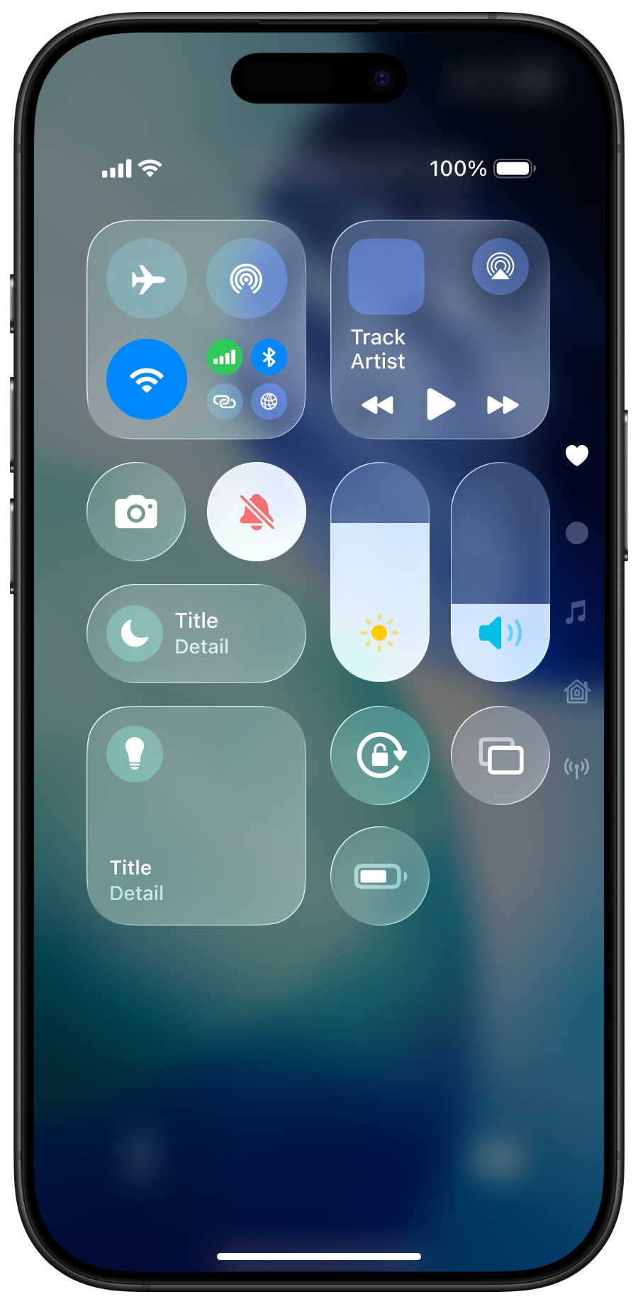
iOS 26 Control Centre using the Liquid Glass design.
2. Re-creating Liquid Glass in Figma (latest update)
Figma 2025.07 introduces a built-in Glass effect, mirroring Apple's specifications.[10][11] To convert any frame or component:
Select frame → Effects → Glass.
Adjust parameters:
Lighting angle (simulates device tilt).
Depth 0-30: Thicker glass increases refraction but harms readability. Keep ≤ 20 for UI controls.[11]
Frost 10-25: For accessible translucency; > 30 looks “milky plastic”.[11]
Maintain text layers above the glass group; apply an inner shadow (white 30%, blur 6) for lift.[12]
Export motion prototypes with Smart Animate to show morphing tab bars and context menus.[11]
Tip: Build two variants—“Default” (full glass) and “Fallback” (20% opacity solid)—and link them to the user’s prefers-reduced-transparency token so devs can swap at runtime.
3. Accessible usage guidelines
Apple’s HIG update and independent audits converge on four rules of thumb:
Minimum contrast: ensure 4.5:1 text/background ratio after blur. Use the new Xcode Accessibility Inspector or Figma Stark plugin.[1][3]
Layer economy: one primary glass sheet per view (toolbar, modal, or floating panel). Avoid stacking two translucent panes; nest buttons on solid fills inside the glass.[5]
Respect system toggles: Reduce Transparency must replace glass with solid colour; Reduce Motion disables parallax highlights.[8]
Motion limits: specular highlight amplitude ≤ 6 px; disable on battery-saver devices to prevent nausea for vestibular-sensitive users.[7][13]
Quick reference table
| Pattern | Do | Avoid | Notes |
|---|---|---|---|
| Navigation bars | Single 15 pt glass with adaptive tint | Glass over video backgrounds | Keeps 4.5 : 1 contrast |
| Cards/modals | Frost 20-25, depth ≤ 15 | Nesting glass inside glass | One translucent layer per Z-group |
| Buttons | Solid fill on glass; glass-on-glass only for featured CTAs at 18 pt+ | Thin outline-only buttons | Solid ensures touch target clarity |
| Icon theme | Default or Light/Dark icons | “All Clear” icons for general public homescreen | Transparent icons fail discoverability for many users |
| Lockscreen clock | Morph within bounding box; leave 8 pt safe area | Overlapping dog ears & time simultaneously | Illustration below |
4. Maintaining the Designed for Humans tone
Designed for Humans advocates a warm, plain-English voice: inclusive, down-to-earth, jargon-free. Keep sentences short, favour active verbs, prioritise clarity over cleverness, and speak directly to people, not “users”.[16]
When writing microcopy for glass components:
Lead with the verb (“Share file”) and drop helper verbs (“Please”) unless politeness adds value.
Offer context hints only when required (“Swipe up to close”).
Ensure tooltips remain visible on solid backgrounds when transparency is off.
5. Updating existing designs
Audit each screen: tag layers as “content”, “chrome”, or “background”.
Replace chrome frames with Glass components; test contrast.
Provide fallback solid styles in the design token file.
Handoff performance budgets: max compositing layers per screen ≤ 4; blur radius ≤ 40 px on iPhone, 60 px on iPad/Mac.[1]
Run accessibility Verifications in TestFlight betas; recruit at least two low-vision testers to validate.[3][8]
Further reading
Apple WWDC25 “Meet Liquid Glass” session video (free on developer.apple.com)
Apple Human Interface Guidelines → Materials → Liquid Glass[1]
Figma Community “Liquid Glass Effect” plugin for pre-set styles[17]
Infinum: “Liquid Glass—Sleek, Shiny and Questionably Accessible” for critique[3]
By applying the material with restraint, testing rigorously, and offering solid fallbacks, designers can harness Liquid Glass’s elegance without leaving any audience behind.
Sources
[1] Liquid Glass - Wikipedia https://en.wikipedia.org/wiki/Liquid_Glass
[2] Liquid Glass - Figma https://www.figma.com/community/plugin/1514712823311805488/liquid-glass
[3] Apple's “Liquid Glass” and What It Means for Accessibility - Reddit https://www.reddit.com/r/webdev/comments/1l85a3n/apples_liquid_glass_and_what_it_means_for/
[4] Meet Liquid Glass - WWDC25 - Videos - Apple Developer https://developer.apple.com/videos/play/wwdc2025/219/
[5] Liquid Glass - Figma https://www.figma.com/community/plugin/1513987776905738207/liquid-glass
[6] Liquid Glass is beautiful, but is it practical, at least on flat screens? https://www.linkedin.com/posts/robindhanwani_designthinking-digitalaccessibility-interfacedesign-activity-7339273200628920321-5Jxs
[7] Apple introduces a delightful and elegant new software design https://www.apple.com/uk/newsroom/2025/06/apple-introduces-a-delightful-and-elegant-new-software-design/
[8] Liquid Glass Effect - Figma https://www.figma.com/community/plugin/1514334122177127393/liquid-glass-effect
[9] Apple's 'Liquid Glass' won't make the sky fall - Curb Cuts https://www.curbcuts.co/blog/2025-6-10-apples-liquid-glass-wont-make-the-sky-fall
[10] Apple introduces a delightful and elegant new software design https://www.apple.com/newsroom/2025/06/apple-introduces-a-delightful-and-elegant-new-software-design/
[11] How to create Liquid Glass in Figma: r/FigmaDesign - Reddit https://www.reddit.com/r/FigmaDesign/comments/1l7k0gn/how_to_create_liquid_glass_in_figma/
[12] Apple's iOS 26 Liquid Glass: Sleek, Shiny, and Questionably ... https://infinum.com/blog/apples-ios-26-liquid-glass-sleek-shiny-and-questionably-accessible/
[13] Apple - Introducing Liquid Glass - YouTube https://www.youtube.com/watch?v=jGztGfRujSE
[14] Liquid Glass - Figma https://www.figma.com/community/file/1514166133209311735/liquid-glass
[15] iOS 26 “Liquid Glass” Design Is A Low Vision Nightmare - Here's Why https://www.youtube.com/watch?v=-tbUNQZsWO0
[16] Liquid Glass Showdown: iOS 26 Beta 1 vs. Beta 3 – What Changed? https://www.geeky-gadgets.com/liquid-glass-showdown-ios-26-beta-1-vs-beta-3-what-changed/
[17] New Glass Effects Feature in Figma | Figma Tutorials - YouTube https://www.youtube.com/watch?v=3ERrrTcx09c
[18] Did Apple abandon its own design heuristics & accessibility ... https://uxdesign.cc/did-apple-abandoned-its-own-design-heuristics-accessibility-principles-2d616ed7ace5
[19] All the Important New iOS 26 Features, From Liquid Glass to Photos App Fixes https://www.cnet.com/tech/services-and-software/all-the-important-new-ios-26-features-from-liquid-glass-to-photos-app-fixes/
[20] How to use the glass effect in Figma - YouTube https://www.youtube.com/watch?v=M6Jg0u7kbOA
[21] designed for humans https://designedforhumans.tech
[22] Is your brand's tone of voice music to your customers’ ears, or just ... https://www.crush-design.co.uk/2025/05/01/is-your-brands-tone-of-voice-music-to-your-customers-ears-or-just-noise/
[23] Why are AI chatbots designed to sound like people? - Command AI https://command.ai/blog/why-are-ai-chatbots-designed-to-sound-like-people/
[24] Brand Voice: What It Is, Why It Matters + Examples | Sprout Social https://sproutsocial.com/insights/brand-voice/
[25] The Four Dimensions of Tone of Voice - NN/g https://www.nngroup.com/articles/tone-of-voice-dimensions/
[26] How To Make AI-Generated Content Resonate With Humans - Acrolinx https://www.acrolinx.com/uk/blog/how-to-make-ai-generated-content-sound-more-human/
[27] 4 recognisable brand voice examples https://www.frontify.com/en/guide/brand-voice-examples
[28] Tone of Voice | Human Digital Insights https://humandigital.com/insights/tone-of-voice
[29] Connecting Human-Centred Design to Innovation https://allthingsinnovation.com/content/connecting-human-centered-design-to-innovation/
[30] What is brand tone of voice, and why does it matter? https://www.jennylucascopywriting.co.uk/2025/05/what-is-brand-tone-of-voice-and-why-does-it-matter/
[31] Brand Tone of Voice: Guide with Real Examples - Lokalise Blog https://lokalise.com/blog/how-to-adapt-your-tone-of-voice-for-new-markets/
[32] Digital humans: the future of human-like technology https://nttdata-solutions.com/us/blog/digital-humans-humanizing-technology-and-improving-user-experiences/
[33] Microsoft's brand voice; above all, human and straightforward https://learn.microsoft.com/en-us/style-guide/brand-voice-above-all-simple-human
[34] What is Brand Voice and Tone, and Why Does It Matter? https://selahcreativeco.com/blog/what-is-brand-voice-and-tone
[35] Riding the wave: from human-centred design to human-centred AI https://uxdesign.cc/riding-the-wave-from-human-centered-design-to-human-centered-ai-5ab0f3b321c9
[36] You're not Duolingo: How to create your iconic brand voice https://www.gotracksuit.com/uk/blog/posts/how-to-create-an-iconic-brand-voice
[37] The Role of Voice, Tone, and Microcopy in UX | Antoinette Houston https://www.youtube.com/watch?v=NNKjvPuCku4
[38] AI and human-centred design: Why you need both https://treehouseinnovation.com/ai-human-centred-design-why-you-need-both/
If you need a business case, accessibility audit, workshop or training, then Designed for Humans can help.
Curious about UX, accessibility and design?
Take a look at our other blogs


