
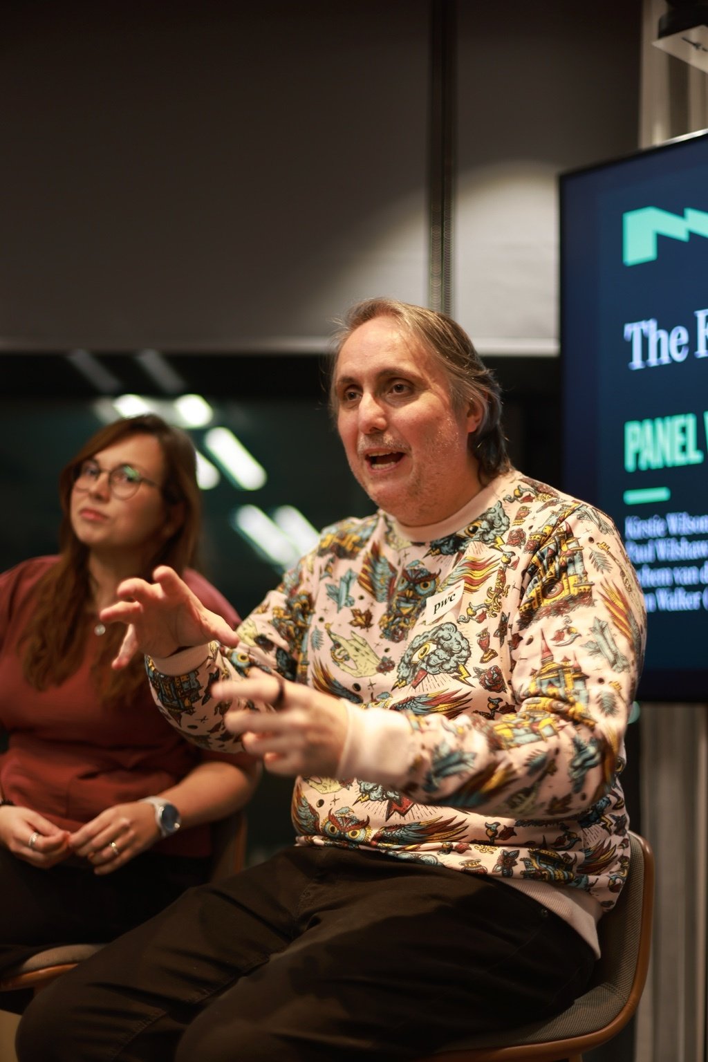
What Does the Future of Experience Actually Look Like? Here's What Four Experts Said at PwC
We talked about big things. Some of us gestured a lot. And apparently I said something about glitter and turds that made it into the official Natter write-up, which feels like a personal milestone. Here's what actually came out of it.
Can Gemini 3 speed up UI design without losing quality? (Yes it can)
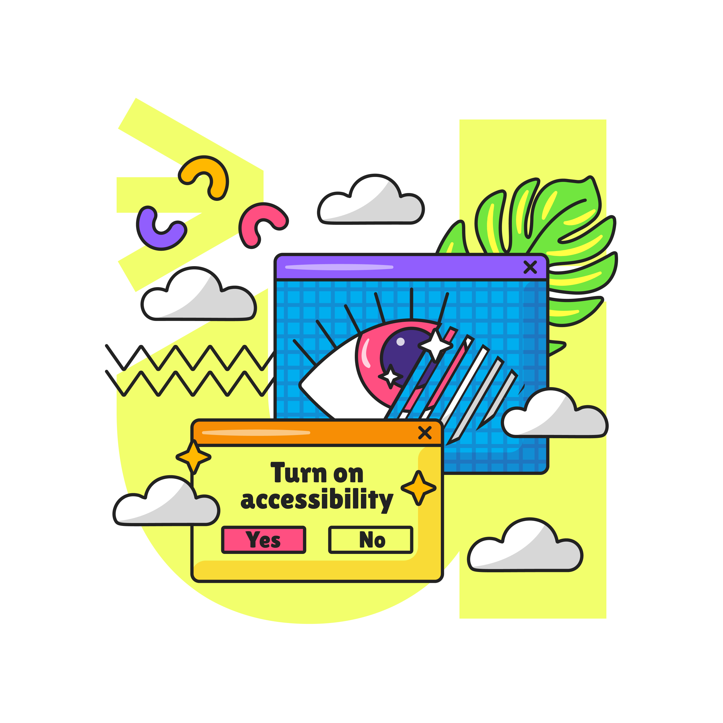
Gemini 3 can speed up UX and UI design without losing quality. This practical guide shows five ways to use it: wireframing, design system tokens and variables, UI to code, consistent visuals, and quick accessibility audits. Copy the prompts, ship useful artefacts, and stay inclusive.

How do you ‘Make’ like a pro with Figma Make for smarter AI-powered prototyping?
Power up Figma Make with prompts that read like a brief, frames that act like systems, and tight constraints. Use the 10 minute Make loop, Prompt DNA and a token bridge to keep prototypes fast, accessible and on brand. Less rework, sharper demos, more time for human craft.

Intuitive interfaces: what actually makes them clear?
Most “intuitive” interfaces are just clear. This article shows how to remove cognitive load with precise language, predictable structure, and visible feedback. Use the clarity trifecta and the 3–30 ladder, run the five-second test, and fix mobile-first friction that costs sign-ups and sales.

Why should designers care about Tailwind and Shadcn in the AI era?
Tailwind and Shadcn help designers and engineers move from ideas to accessible, consistent interfaces at speed, especially in an AI workflow.

Inclusive by design: Supporting Dyslexia Awareness Week 2025
Accessibility is at the heart of our business and to support Dyslexia Awareness Week 2025 we’ve created a free accessibility guide to make it easier for dyslexic people to navigate your website.
Designing with assumptions is slowing you down
In UX, the most damaging decisions aren’t usually made out of laziness or ego, they’re made out of assumption
Assuming users know what that icon means.
Assuming the flow is logical.
Assuming people actually read error messages (spoiler: they don’t).
Read our top tips to avoid designing with assumptions.
Getting the wrong answer helps you innovate (and find the real problem faster)
We’ve all been told the same story: be efficient, be lean, get to the “right” solution fast. The trouble is, that mindset can quietly box you in. Here’s the another way: the fastest way to better design might be through deliberately bad ideas. Sounds wrong, doesn’t it?

Scaling up: User-Centric design for Tech Start-ups in Manchester
Start-ups are rewriting the rulebook on how to launch products that matter. Tight budgets and impossible timelines might sound like a recipe for compromise. Yet, these ventures are proving that bold design thinking, rapid prototyping, and a relentless focus on users can turn constraints into a competitive edge.
Navigating the digital landscape: Inclusive UX for Healthcare
Designing Healthcare for Everyone: From Legacy Systems to Human-Centred Digital Care. A Design Thinking approach proves invaluable. It begins with Empathise: conducting in-depth user research, perhaps through ethnographic studies.

Apple’s New Liquid Glass Design: Practical Guidance for Designers
The Liquid Glass language introduces a translucent, adaptive UI material across Apple’s 2025 OS releases and now ships in Figma’s latest effect update. When used thoughtfully, it can enrich hierarchy, but it carries real performance and accessibility costs if over-applied. The sections below summarise the design’s strengths and pitfalls, show how to recreate it in Figma, and outline best-practice patterns to keep products inclusive.
The European Accessibility Act: A Strategic Opportunity for UK Businesses
In this blog we simplify the European Accessibility Act (EAA), which came into force on 28 June 2025, and we have created a free action plan design guide which contains immediate actions, a short-term strategy and a long term vision action plan checklist to help you to prepare for the EAA.

UX isn’t a department, it’s a culture
When scaling a product, it's easy to treat UX as a design step, something to layer in once the roadmap is set and the screens are ready to be polished.
In the most successful start-ups we work with, UX isn't a phase or a team. It's a way of thinking that cuts across product, engineering, comms and leadership. It’s a culture of curiosity, clarity, and co-creation, from the first idea to the final release.
AI needs a better interface, and fast
Remember When Search Was Simple?
Back when Google ruled the digital world, the interface was brilliantly simple: a single box, a blinking cursor, and instant results. It felt easy. Fast forward to today, and many so-called innovative tools have kept that same box, but the experience feels anything but simple.

Why so many start-ups struggle with simple and how to get it right
In this blog find out how to simplify your product before launch and download our free toolkit to uncover the UX, brand, and messaging mistakes that are slowing your start-up down, and find out how to fix them before your next funding round.
When brand gets in the way: Rethinking consistency and clarity in UX
Two of the most commonly misunderstood design principles are consistency and cleverness. Ironically, both are often applied in the name of branding but they can quietly undermine the user experience when left unchecked.
Find out why it’s more important to focus on the user's best interest.

Innovating digital products for real humans
This article is for product managers, UX/UI designers, and innovation leaders who find their digital products aren't resonating with their intended audience. If you're noticing high churn rates or low engagement despite having advanced tech, this post is your guide.

From launch to lag: What happens when UX is treated as complete?
One of the most persistent misunderstandings about UX is the belief that it has a finish line. A sprint ends, a prototype gets signed off, the feature goes live—and it’s ticked off as “done”.
The illusion of “done” is comforting, but dangerous. Read more to find out why.

Why more data doesn’t always mean better UX
Product teams often rely heavily on analytics to drive UX decisions—bounce rates, click-throughs, session durations. These are all useful signals. But I’ve noticed a growing trend: we’re drowning in data and starving for insight.
Find out why more data doesn’t always mean better UX.

When UX crosses the line: The new face of dark patterns
The conversation around dark patterns hasn’t gone away it’s just evolved. What I’m seeing more frequently now is this: the most manipulative UX tactics no longer look obviously deceptive. Instead, they hide behind the language of personalisation, nudging, or even growth experimentation.
Good UX is persuasive, not manipulative. There’s a meaningful difference—and your users can feel it. The strongest products aren’t just optimised for clicks, they’re built for credibility.