Why good UX is invisible
From our experience, the best UX often goes unnoticed. If users don’t think about your design, it’s usually because it just works. No frustration, no confusion—just a seamless experience.
You may want to design flashy visuals and complex interactions, but real users just want to get things done with minimal effort. A slick interface means nothing if people struggle to complete basic tasks.
💡 Actionable tip
Make your UX genuinely user-friendly:
✅ Reduce cognitive load. Every extra step, unnecessary decision, or hidden feature adds friction
✅ Prioritise consistency. Familiar layouts and predictable interactions reduce the need for users to ‘learn’ your product
✅ Test and refine. If users hesitate or make errors, something isn’t as intuitive as you think.
The best UX isn’t about what looks good—it’s about what feels effortless.
Designed for Humans is here to make your UX resonate and work for real humans.
Curious about UX and design?
Take a look at our other blogs

There's something quietly radical about standing in a gallery full of Lowry originals whilst wearing a shirt covered in the very same matchstick figures staring back at you from the walls. Art, conversation, impeccable shirts, and a few things about Lowry himself that most people never know.
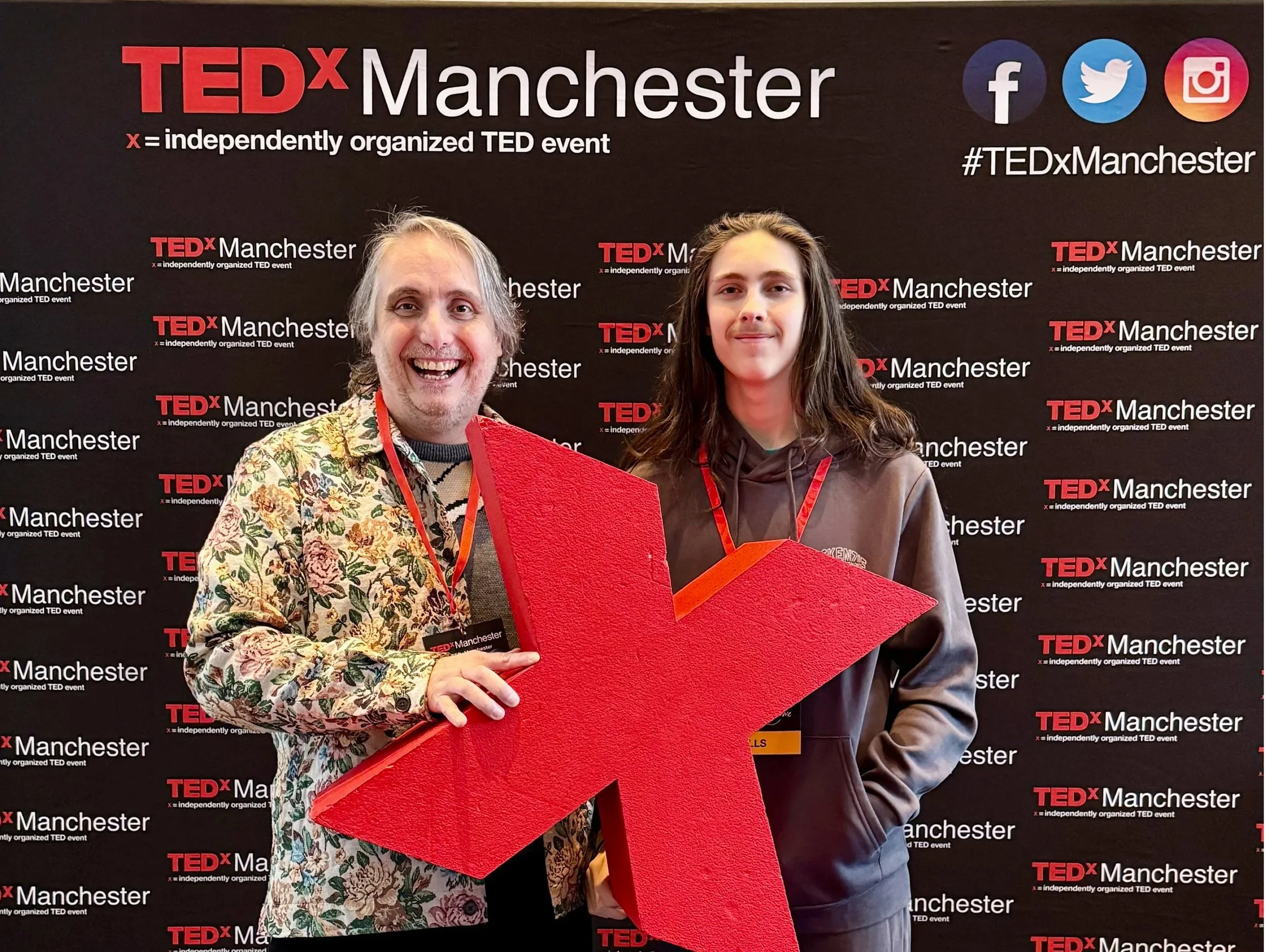
TEDx Manchester 2026 at the Bridgewater Hall — seven hours, ten speakers, one very large stage. Here are the five talks that landed hardest, and what they mean for how we work, think, and pay attention.
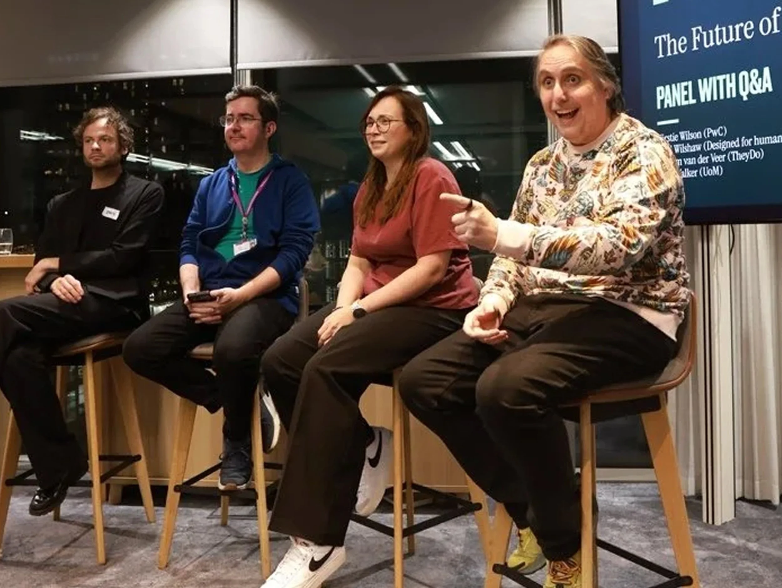
We talked about big things. Some of us gestured a lot. And apparently I said something about glitter and turds that made it into the official Natter write-up, which feels like a personal milestone. Here's what actually came out of it.
As the year wraps up, we wanted to say a big, genuine thank you for all your support. Whether you have worked with us, cheered us on, challenged our thinking or simply believed in what we are building, thank you for being part of our story so far.
Gemini 3 can speed up UX and UI design without losing quality. This practical guide shows five ways to use it: wireframing, design system tokens and variables, UI to code, consistent visuals, and quick accessibility audits. Copy the prompts, ship useful artefacts, and stay inclusive.
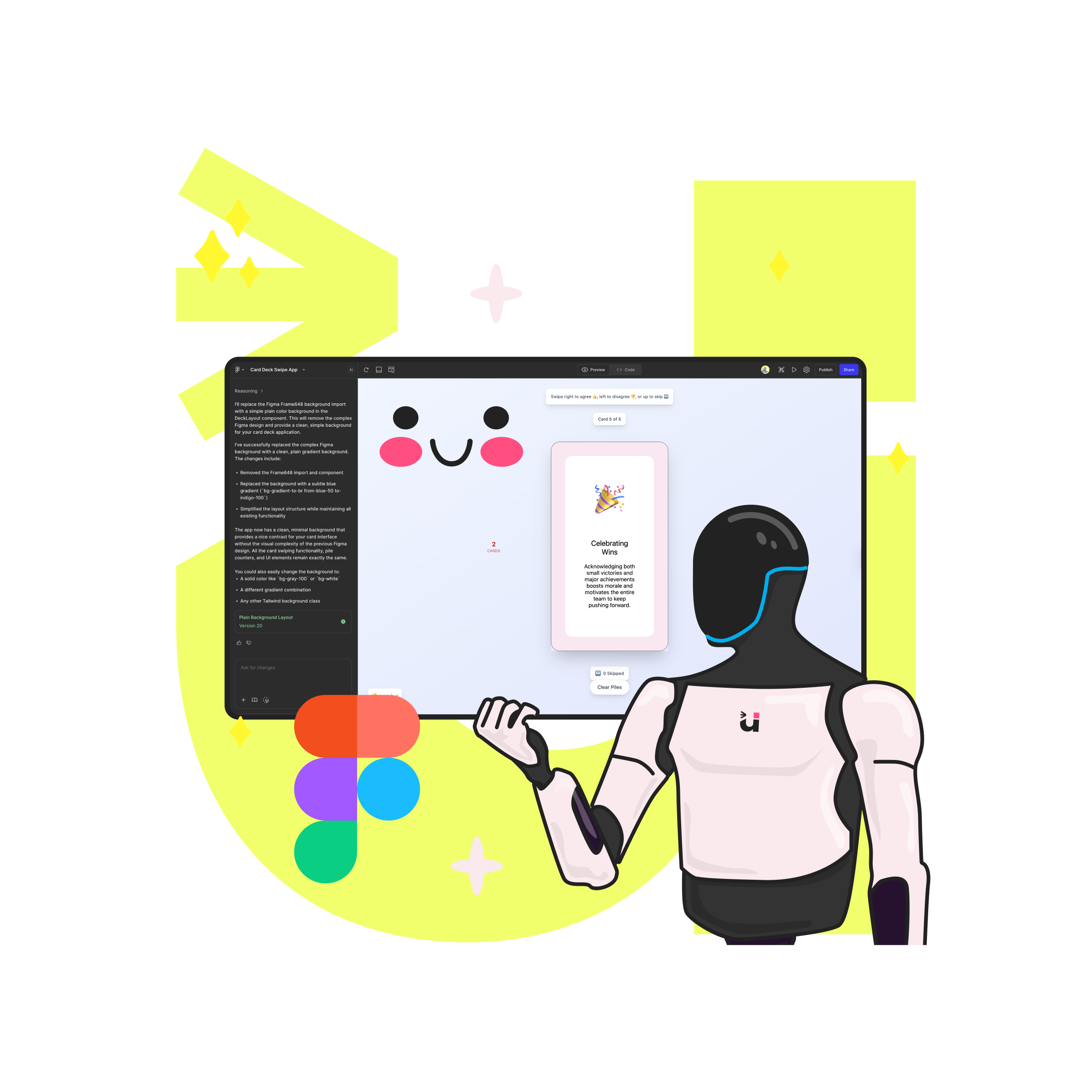
Power up Figma Make with prompts that read like a brief, frames that act like systems, and tight constraints. Use the 10 minute Make loop, Prompt DNA and a token bridge to keep prototypes fast, accessible and on brand. Less rework, sharper demos, more time for human craft.
Most “intuitive” interfaces are just clear. This article shows how to remove cognitive load with precise language, predictable structure, and visible feedback. Use the clarity trifecta and the 3–30 ladder, run the five-second test, and fix mobile-first friction that costs sign-ups and sales.
Tailwind and Shadcn help designers and engineers move from ideas to accessible, consistent interfaces at speed, especially in an AI workflow.
We craft innovative technology, inclusive products, accessible UX, communication solutions and delightful design experiences.