
Intuitive interfaces: what actually makes them clear?
Remove the roadblocks that stop users from understanding your product
Time to read: 10 minutes

TLDR
Clarity comes from three things working together: precise language, purposeful structure, and timely feedback. Most intuitive products reduce cognitive load and decision effort, especially in the first three to ten seconds. This piece gives two practical frameworks, a table you can copy, and steps you can run this week.
Intro
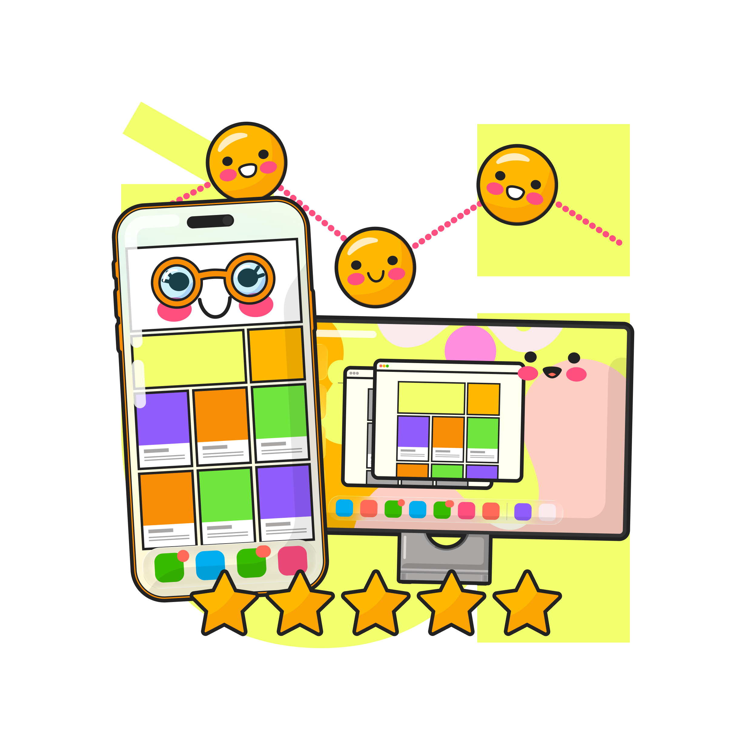
People do not read interfaces. They glance and decide. On mobile the decision is faster. If users cannot answer what it is, who it is for, and what happens next, they leave. Your job is not to impress. Your job is to be understood quickly.
The problem
Teams ship features that feel clear internally but confuse real users. Clever headlines, abstract icons, low-contrast text, and drifting patterns add up to friction. Mobile often suffers most. We design on desktop and do a cursory mobile check. Meanwhile most visits are on phones, with thumbs, glare, and one hand free.
The human case for change
One in five people in the UK lives with a disability. Dyslexia-friendly writing and consistent layouts help everyone. High contrast, short sentences, and predictable navigation reduce effort and improve trust. Building for inclusion is both right and commercially smart.
The solution
Clarity is a system. Treat it like one. Start with words users understand. Arrange content in the order people make decisions. Back it up with visible states and honest feedback. Test by timing comprehension, not by asking opinions.
Framework: the clarity trifecta
- Label: say exactly what the thing is or does. Avoid cleverness. Make the noun obvious and the verb predictable.
- Context: place the thing where the user expects it. Use standard positions and patterns. Support scanning in three to ten seconds.
- Feedback: show state and consequence. Disabled looks disabled. Errors explain what happened and how to fix it. Use plain English.
Framework: the 3–30 ladder
- 0–3 seconds: hook, qualify, promise. A clear headline tells who it is for and what they gain. One strong image that supports the message. Primary action within thumb reach.
- 3–10 seconds: proof and what it is. A short subheadline that spells out what, how, and when. Add a small trust element.
- 10–30 seconds: how it works and answers to doubts. Progressive disclosure, not walls of text. Place CTAs to match conviction.
Framework: clarity patterns by component
| Component | Clarity tactic | Quick test |
|---|---|---|
| Hero section | Headline that hooks, qualifies, and promises. Subheadline answers what, how, and when. Image supports the message. | Five-second test: what is it, who for, main benefit. Pass all three. |
| Primary button | Use outcome language. Verb plus object the user expects. | Would a stranger predict what happens after click? If not, rewrite. |
| Form fields | Generous spacing. Clear labels above fields. Touch targets large enough for thumbs. | Watch a user on mobile. Count mis-taps. Reduce to near zero. |
| Error states | Explain the issue and the fix in plain English. Keep focus visible. Preserve input. | Can users recover without help? If not, add guidance. |
| Navigation | Keep structure and position consistent across pages. | Can a first-time user find the same item twice in a row? |
| Typography and colour | Sans-serif, readable sizes, strong contrast. Avoid light grey on white. | Meet or exceed WCAG 2.2 AA contrast. |
Case studies or proof points
- B2B SaaS: Before: scattered patterns, vague CTAs. During: clarity trifecta applied to hero and pricing. After: support tickets on “how do I start” fell by 32 percent.
- Fintech onboarding: Before: long form with unclear errors. During: labels above fields, stronger contrast, actionable error copy. After: completion rate up 18 percent.
Actionable steps
- Run the five-second test on your hero. If three answers are not instant, cut words and change the image.
- Rewrite your primary CTA to state the outcome, not “Submit” or “Continue.”
- Move mobile CTAs and key controls within comfortable thumb reach. Increase touch targets and spacing.
- Fix contrast and type. Use a readable sans-serif and meet WCAG 2.2 AA.
- Watch one uninvolved person use the page. Note confusion points and mis-clicks. Ship one improvement per day.
Common pitfalls
- Clever over clear. Replace witty headlines with specific promises.
- Generic images. Use product, transformation, or problem shots only.
- Desktop bias. Test on phones in real grips. Space form controls for thumbs.
- Low contrast and tiny type. Raise contrast and size for legibility.
- Asking opinions, not observing behaviour. Time comprehension. Watch where people click and where they give up.
- Walls of text. Use short sentences and plain English.
- Inconsistent navigation and labels. Standardise names and positions.
- CTA famine or overload. Place actions to match conviction levels through the page.
Downloadable resources
- Clarity audit checklist — Link: {placeholder}
- Five-second test worksheet — Link: {placeholder}
- Error copy cheatsheet — Link: {placeholder}
FAQs
Q1: How do I know if our interface is intuitive for new users?
A1: Time comprehension. If a stranger cannot explain what it is, who it is for, and what happens next in five seconds, you have work to do.
Q2: What quick wins help most on mobile?
A2: Put the primary action within thumb reach. Increase target sizes and spacing. Avoid top-corner dead zones.
Q3: How do we make forms clearer without redesigning everything?
A3: Labels above fields, larger targets, clear error copy with a fix, and saved input on error. Then watch one person complete it.
Q4: How does accessibility fit into clarity?
A4: Accessibility is clarity. Dyslexia-friendly writing, consistent layouts, and strong contrast reduce effort for everyone. Meet WCAG 2.2 AA as a baseline.
Q5: How do we keep our brand voice while getting clearer?
A5: Use British English, plain language, and short sentences. Keep the personality in structure and examples, not in jargon.
Final answer
Interfaces feel intuitive when users can answer what it is, who it is for, and what happens next within seconds. That comes from precise words, predictable structure, and visible feedback that reduce decision effort. Design the first screen for comprehension, not decoration. Support it with proof and progressive detail as people scroll. Test by timing understanding and watching behaviour, then remove anything that slows the answer down.
Further reading
Explore our UX and UI services to raise clarity across your product

See how we ship product changes with pace and inclusion

Get practical comms that support clear UX
Read our guidance on the European Accessibility Act

Free consultation
We partner with you to identify pitfalls and help you to correct them, helping you increase customers and make more sales.
External references
WCAG 2.2, W3C. Contrast and interaction standards that improve clarity: https://www.w3.org/TR/WCAG22/
GOV.UK Service Manual. Clear content and inclusive service patterns: https://www.gov.uk/service-manual
Nielsen Norman Group. Research on clarity, comprehension and interaction design: https://www.nngroup.com/