
Why should designers care about Tailwind and Shadcn in the AI era?
Faster, clearer, more accessible interface work with fewer surprises
Time to read: 8 minutes
TLDR
Tailwind and Shadcn help designers and engineers move from ideas to accessible, consistent interfaces at speed. Tailwind constrains styling to a shared system. shadcn gives production-ready React components you own, built on accessible Radix primitives. In an AI workflow, these standards reduce guesswork and make AI-generated UI safer to ship. This article shows how to use both without losing craft.
Intro
Teams are prototyping with AI. Code arrives fast, but quality and consistency lag. Designers need a clear way to keep interfaces coherent, accessible, and easy to change. Tailwind’s utility classes create a constrained visual language. shadcn provides copy-and-paste React components that follow good accessibility practice via Radix. Together, they reduce rework and help you meet standards. Tailwind v4 is stable and widely adopted, and shadcn’s approach is now a default choice in many modern stacks.
The problem
For scale-ups and SaaS teams, UI drifts. Designers hand off Figma to devs who interpret tokens differently. Accessibility states such as focus, error, and keyboard navigation, are inconsistent. AI prototypes make this worse when they improvise styles. The result is rework, slower delivery, and higher risk in regulated contexts. GOV.UK sets a clear baseline at WCAG 2.2 AA, yet many products still fail basic focus visibility.
The human case for change
People using keyboards, screen readers, or magnifiers must see focus, navigate with keys, and understand labels. WCAG 2.2 requires visible focus indicators and defines how strong they should appear. Radix primitives implement expected patterns for tabs, menus, dialogues, and more, so users are not surprised by broken keyboard behaviour. This is not just compliance. It is respect.
The solution
Use Tailwind as the shared visual language. Use shadcn components as the accessible building blocks. Map design tokens to Tailwind’s theme so designers and engineers speak the same words for spacing, colour, and type. Keep the components in your repo so you can adapt, test, and document them. Align with GOV.UK’s approach of component-level accessibility checks.
Framework
Utility→Component→Pattern
Step 1: Utility. Lock visual decisions in Tailwind utilities and theme. Constrain choice to reduce drift and speed reviews.
Step 2: Component. Adopt shadcn components that wrap Radix primitives. You copy them into your codebase, you own them, and you can enforce tokens and states.
Step 3: Pattern. Compose components into journeys with documented states. Test keyboard and focus as part of the pattern, not as a late fix.
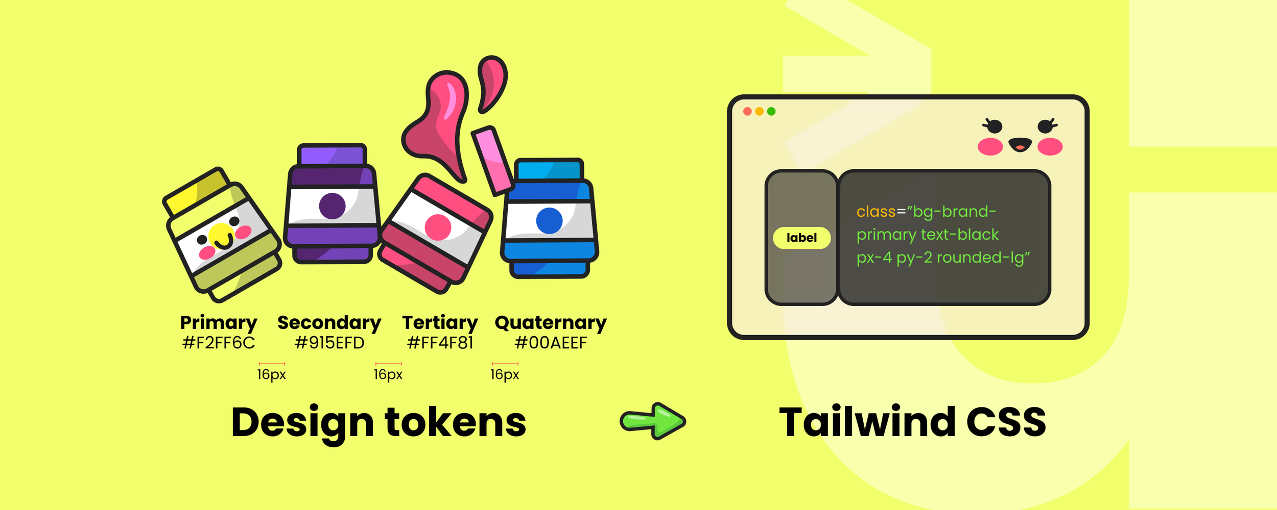
Token Bridge
Map your design tokens to Tailwind and your documentation.
| Decision | Token example | Tailwind mapping | Test |
|---|---|---|---|
| Brand colour |
color.brand.600
|
bg-brand-600
|
Contrast 4.5:1 minimum |
| Spacing scale |
space.200
|
p-5
|
Consistency across screens |
| Focus ring |
focus.outline
|
focus:ring-2
ring-offset-2
|
Meets 2.4.7 and 2.4.13 |
| Radius |
radius.md
|
rounded-md
|
Matches brand corners |
Case studies or proof points
B2B SaaS dashboard: Before → Inconsistent spacing and ad-hoc CSS increased review cycles. During → Tokens aligned to Tailwind theme and Shadcn buttons, inputs, and dialogues replaced custom code. After → PR cycle time on UI tickets dropped 28%, and accessibility defects related to focus fell by 60% in four weeks.
Fintech onboarding: Before → Keyboard traps in modals and unclear error states. During → Adopted Shadcn Dialogue and Form with Radix focus management and labelled fields. After → Completion rate increased from 63% to 74% and no critical a11y issues in the next audit.
Content platform: Before → Three button variants across codebases. During → Single shadcn Button tied to tokens, snapshot-tested in Storybook. After → Bug count for buttons reduced by 40% quarter-on-quarter.
Actionable steps
Create a Tailwind theme file from your tokens. Include colours, spacing, typography, and focus ring.
Install shadcn and generate five core components first: Button, Input, Select, Dialogue, and Toast. Wire to tokens.
Enable keyboard testing in CI. Check focus visibility and order on every component and page template.
Add an accessibility checklist to design and code reviews. Follow GOV.UK and WCAG.
Run a five-second comprehension test on your key screens to catch ambiguity before you style.
Common pitfalls
Treating shadcn as an npm library. It is copy-paste. Keep components in your codebase. Fix: generate, then refactor to your standards.
Hiding focus styles to look cleaner. Fix: design a high-contrast focus ring that meets 2.4.7 and 2.4.13.
Mixing ad-hoc CSS with utilities. Fix: enforce Tailwind classes and theme; ban inline style one-offs.
Token drift between Figma and code. Fix: one token source, exported to Tailwind. Use the W3C format.
Skipping component-level a11y testing. Fix: follow GOV.UK’s practice of automated and manual checks per component.
Letting AI invent patterns. Fix: constrain prompts to your component library and tokens. Review focus and labels first.
FAQs
Q1: Do designers need to write Tailwind classes?
A1: No. Designers need to understand the scale and names so specs are unambiguous. Token names should map to Tailwind theme keys.
Q2: Is Shadcn accessible out of the box?
A2: Shadcn components use Radix primitives that follow WAI-ARIA patterns. You must still provide labels, contrast, and focus styles.
Q3: How does this help in regulated sectors?
A3: Consistent components and visible focus states reduce WCAG failures and speed audits. Documented patterns match GOV.UK guidance on component accessibility.
Q4: Will Tailwind bloat my HTML?
A4: Tailwind compiles only the used utilities. v4 improves performance and configuration, so teams get speed without shipping unused CSS.
Q5: How do we measure impact?
A5: Track Pull Request (PR) cycle time for UI tickets, a11y defect counts, completion rates, and time-to-first-prototype. Run a five-second test on hero screens monthly.
Final answer
Designers should care because Tailwind and Shadcn turn vague design intent into consistent, accessible code that teams can ship fast. Tailwind constrains styling to a shared system, which improves clarity and reduces drift. shadcn provides accessible React components built on Radix so patterns behave as users expect. In AI-accelerated workflows, these constraints make generated UI safer and easier to review. Map your tokens, adopt a small set of shared components, and test focus and labels as you go. That is how you scale design without losing humanity.
Further reading

Accessibility isn’t just compliance — why it matters to users and teams.
When brand gets in the way — how to keep clarity in UX.

Innovating digital products for real humans — our approach.
Free EAA action plan — prepare for accessibility law.

Free consultation
We partner with you to accelerate and create a design system that blends seamlessly into your workflow and brand.
External references
Tailwind CSS, Core concepts: utility classes and states — why constrained utilities improve consistency. https://tailwindcss.com/docs/styling-with-utility-classes
Tailwind CSS v4.0 release — performance and configuration updates. https://tailwindcss.com/blog/tailwindcss-v4
shadcn/ui, Introduction — copy-and-paste components you own, built with Radix and Tailwind. https://ui-private.shadcn.com/docs
Radix Primitives, Accessibility overview — keyboard navigation, focus management, and WAI-ARIA practices. https://www.radix-ui.com/primitives/docs/overview/accessibility
W3C, WCAG 2.2 Understanding Focus Visible and Focus Appearance — requirements for visible focus. https://www.w3.org/WAI/WCAG22/Understanding/focus-visible.html and https://www.w3.org/WAI/WCAG22/Understanding/focus-appearance
GOV.UK Design System, Accessibility strategy — component-level testing and principles. https://design-system.service.gov.uk/accessibility/accessibility-strategy/
W3C Design Tokens Community Group — first stable Design Tokens specification. https://www.w3.org/community/design-tokens/2025/10/28/design-tokens-specification-reaches-first-stable-version/