
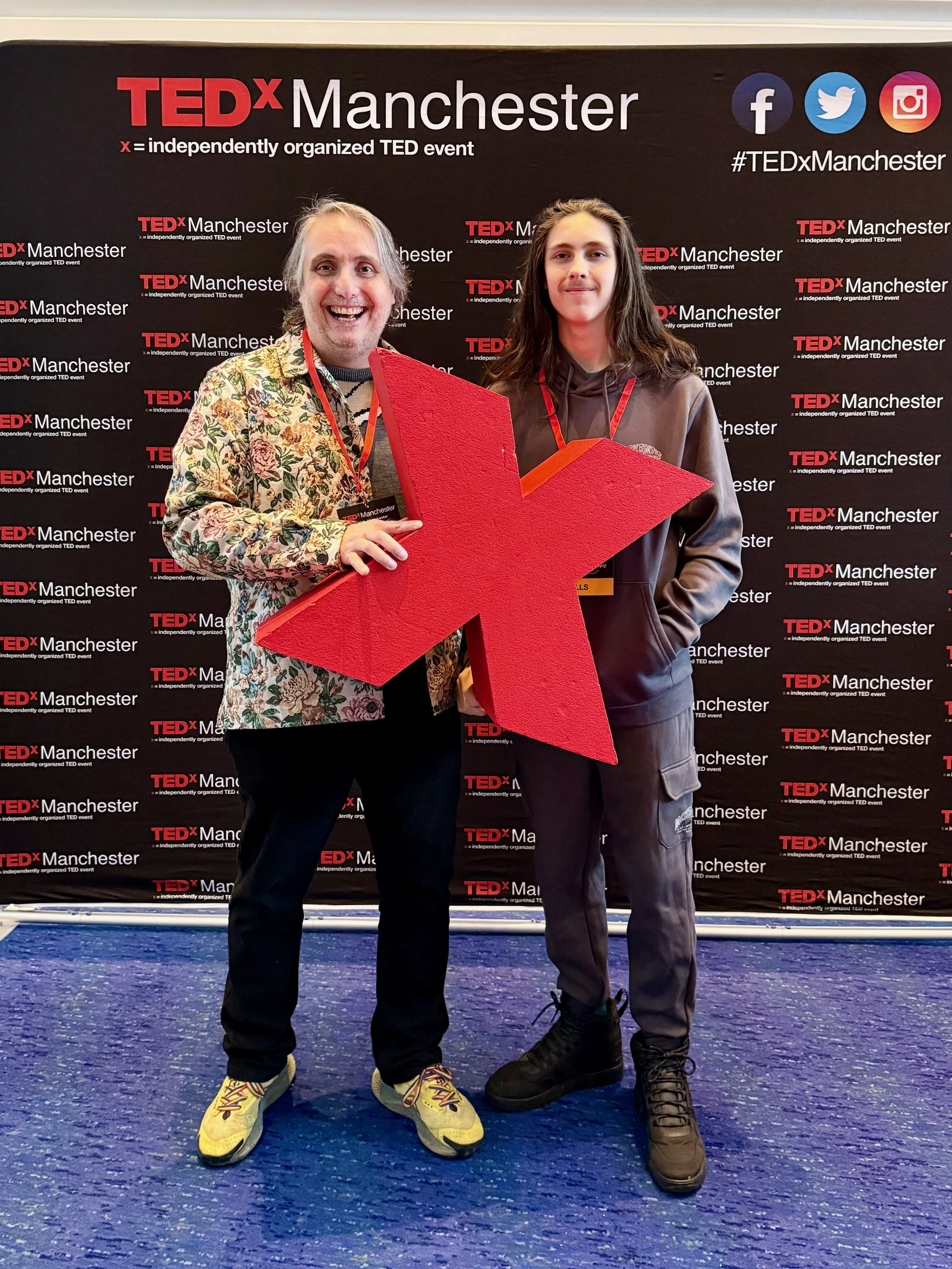
What TEDx Manchester Taught Me About Listening, Living, and Letting Go of Your To-Do List
TEDx Manchester 2026 at the Bridgewater Hall — seven hours, ten speakers, one very large stage. Here are the five talks that landed hardest, and what they mean for how we work, think, and pay attention.
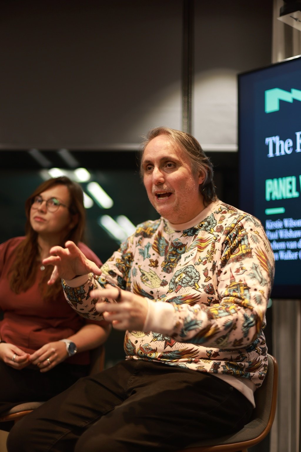
What Does the Future of Experience Actually Look Like? Here's What Four Experts Said at PwC
We talked about big things. Some of us gestured a lot. And apparently I said something about glitter and turds that made it into the official Natter write-up, which feels like a personal milestone. Here's what actually came out of it.

Intuitive interfaces: what actually makes them clear?
Most “intuitive” interfaces are just clear. This article shows how to remove cognitive load with precise language, predictable structure, and visible feedback. Use the clarity trifecta and the 3–30 ladder, run the five-second test, and fix mobile-first friction that costs sign-ups and sales.

Inclusive design for social impact
Social impact organisations are realising that good intentions alone aren’t enough. To win hearts, funding, and volunteers, they need stories that feel real, campaigns that include everyone, and platforms that work for all. By blending empathy-driven storytelling with inclusive design principles.