
How do you ‘Make’ like a pro with Figma Make for smarter AI-powered prototyping?
A power user’s guide to prompts, frames, iteration and workflows that scale.
Time to read: 9 minutes
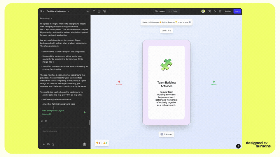
Prototyping a swipable card design in Figma Make, from idea to prototype within a few minutes.
TLDR
Figma Make works best when you give it strong direction. Treat your prompt like a design brief and your frame like a system. Start small, iterate fast, and keep accessibility and tokens in play so results stay on brand. Use Make to accelerate structure and interaction, then add human craft.
Intro
AI can speed you up or slow you down. The difference is structure. Power users give Make clear intent, clean frames and sharp constraints. The result is smarter flows, fewer reworks and prototypes that feel closer to product. This guide shows the patterns that work, with checklists you can run today.
The problem
Vague prompts, messy layers and missing constraints lead to noisy output. Teams regenerate screens that never quite fit brand or behaviour. Interaction fidelity lags behind. Accessibility slips. You lose time fixing what Make could have produced if it had better inputs.
The human case for change
Clarity reduces cognitive load for everyone. When you name layers, set tokens and plan behaviours, Make produces patterns that are easier to understand and test. Dyslexia friendly text styles, high contrast colours and predictable navigation help all users, not just some. Building inclusively from the start also de risks future compliance work.
The solution
Use Make as a creative partner, not a replacement. Give it context, constraints and examples. Work in modular steps. Keep humans on the loop for intention, taste and ethics. Lock in accessible styles so speed never breaks inclusion.
Framework: Prompt DNA
- Context: where does this flow live and who is it for
- Behaviours: clicks, hovers, inputs, empty states and errors
- Constraints: device, layout grid, density, brand tokens, accessibility rules
- Content: sample copy, field labels, states and validation text
- Outcome: what a good result looks like and what to avoid
Prompt template
Use this pattern to brief Make:
- Audience and goal: “Onboarding for first time users of a budgeting app. Goal is verified signup in under 60 seconds.”
- Scope: “Two screens. Email capture and verification. Include error states.”
- Structure: “Auto Layout. 12 column grid on desktop. 8 point spacing. 44 px hit targets.”
- Style: “Use brand tokens. Primary button, neutral surface, accessible focus styles. Avoid low contrast text.”
- Behaviours: “Disable button until form valid. Show inline validation. Offer magic link and code entry.”
- Success: “Clean, legible, keyboard friendly. Clear visual hierarchy. Ready to connect to prototype interactions.”
Framework: The 10 minute Make loop
- Prepare: tidy the frame. Auto Layout on. Name layers. Remove hidden junk.
- Make: run a focused prompt for a small scope, like a two screen flow.
- Review: test interactions. Check spacing, content and contrast.
- Refine: adjust text, swap components, tighten states. Re run if structure is wrong.
- Commit: when one slice feels solid, duplicate it as the pattern for the next slice.
Framework: Token bridge
Use tokens to keep AI output consistent with your system. Map brand tokens to Make constraints so generated UI snaps to the rules you already trust.
| Design token | Example values | Map to Make | Accessibility note |
|---|---|---|---|
| Colour | --brand.primary= #0B5FFF, --text= #222222 | Declare primary, neutrals and role based colours in prompt | Meet WCAG 2.2 AA contrast on text and controls |
| Typography | Body 16 px, Line height 1.5, Headings 24–32 px | State sizes and scale. Ask for sentence case labels | Minimum 16 px body. Avoid all caps. Left aligned |
| Spacing | 8 px scale. Section gaps 24–40 px | Set spacing steps and container padding | Larger tap areas and generous line height improve readability |
| Radii | Buttons 8 px, Cards 12 px | Specify radii per component class | Consistent shapes aid recognition |
| Focus | 2 px outline, 4 px offset | Request visible focus on interactive elements | Keyboard users need clear states on all paths |
Proof points
- B2B SaaS onboarding: Before → ad hoc prompts produced three clashing patterns. During → Prompt DNA plus token bridge. After → one coherent flow and a 35% cut in rework within the sprint.
- Marketplace dashboard: Before → static screens with manual hotspots. During → 10 minute Make loop with micro interactions. After → stakeholder demo in 24 hours, down from a week.
- Accessibility baseline: Before → inconsistent colours from regenerated screens. During → colour and focus tokens pinned in the prompt. After → zero contrast regressions in handoff checks.
Actionable steps
- Write one Prompt DNA for a single two screen flow. Run it. Ship the pattern.
- Clean the frame: Auto Layout, named layers, unused layers removed.
- Add brand tokens and focus styles to your prompt.
- Test keyboard paths and errors before you regenerate.
- Log what language worked. Build a prompt library for your team.
- Move from slice to slice: signup, then dashboard, then settings.
Common pitfalls
- Giant prompts that try to build the whole app. Fix: scope to two or three screens.
- Messy layers. Fix: suggest Auto Layout, rename layers, delete the hidden.
- Brand drift. Fix: declare tokens and roles up front.
- Shiny but unusable flows. Fix: require focus states and keyboard paths.
- Regenerate too soon. Fix: tweak content and spacing before you re run.
- Ignoring copy. Fix: provide real field labels, hints and errors.
- No measurement. Fix: track rework cycles and time to demo across sprints.
FAQs
Q1: How detailed should my prompt be
A1: Detailed enough to remove guesswork. Include context, behaviours, constraints, content and outcome. Keep scope small.
Q2: Do I need to prep frames before I Make
A2: Yes. Use Auto Layout, name layers clearly and remove hidden clutter. Clean inputs lead to clean outputs.
Q3: How do I keep results on brand
A3: Use the token bridge. Declare colours, typography, spacing, radii and focus styles in the prompt. Reuse components.
Q4: What about accessibility
A4: Bake it in. Ask for visible focus, minimum 16 px body text, high contrast and keyboard paths. Test with a screen reader on one flow per sprint.
Q5: How do I measure value
A5: Track two metrics. Time to first demo and number of rework cycles per flow. Aim to cut both by at least a third over two sprints.
Final answer
You Make like a pro by treating Figma Make as a system partner. Write prompts that read like a brief. Set tokens, grids and behaviours before you generate. Work in small, testable slices with a tight loop of make, review and refine. Keep accessibility rules in your prompt and in your checks. Use Make to accelerate structure and variation, then add human judgement to finish.
Further reading

How we design accessible, scalable interfaces

Product and innovation services
What the law means for teams

Free consultation
Accelerate your design to development handovers, create prototypes with meaning and stay ahead of the AI-curve.
External references
Figma Make: AI-driven, prompt-to-app tool that lets you bring ideas and existing Figma designs to life as functional prototypes, web apps, and interactive UI. https://help.figma.com/hc/en-us/articles/31304412302231-Explore-Figma-Make
WCAG 2.2, W3C: Baseline for contrast, focus and input targets. https://www.w3.org/WAI/standards-guidelines/wcag/
GOV.UK Service Manual: Practical guidance on accessible services. https://www.gov.uk/service-manual
Nielsen Norman Group on AI and UX: Patterns for clarity and trust. https://www.nngroup.com/topic/ai/
Diagram by Figma: AI-assisted design tools. https://diagram.com/
Magician for Figma: Prompt-based icons, copy and illustrations. https://magician.design/
Uizard: Turn sketches into editable designs. https://uizard.io/