
Can Gemini 3 speed up UI design without losing quality? (Yes it can)
Five practical use cases with prompts, examples, and artefacts you can ship today.
Time to read: 12 minutes
TLDR
Gemini 3 is ready for day‑to‑day UI work. This article shows five practical cases with prompts, examples and checks. You will wireframe faster, set solid design system foundations, turn UI into code, create consistent visuals and run quick accessibility audits. Use the prompts, then adapt them to your workflow.
Intro
Design teams are under pressure to deliver more with less. Handovers slow down. Design systems drift. Visuals become inconsistent. Gemini 3 helps when you guide it with clear prompts, constraints and checks. This guide is for busy product designers, design engineers and design leaders who need speed without sacrificing quality.
The problem
UI work has many small tasks. Each takes time. Rework happens when teams skip structure and checks. AI can amplify good practice or amplify chaos. We need a reliable way to brief, review and ship.
The human case for change
People use your product, not your process. Faster cycles matter only if the result is clearer, kinder and more inclusive. Gemini 3 can help you include more voices, test more ideas and surface accessibility issues earlier. That saves users time and removes friction.
The solution
Use Gemini 3 as a structured partner. Give it roles, inputs and outputs. Ask for artefacts that designers and engineers can use right away. Always add acceptance criteria, and run a quick audit before you ship.
Framework: Prompt‑to‑Prototype Loop
- Define audience, job‑to‑be‑done and constraints.
- Ask for low‑fidelity first, then refine.
- Add acceptance criteria and a review checklist.
Wireframing prompts
Role: Senior product designer
Context: Mobile retail app. Task flow = browse list → view details → add to basket → checkout.
Constraints: WCAG 2.2 AA contrast. iOS 13+ patterns. Dyslexia‑friendly labels.
Ask: Create 3 alternative wireframes for the flow with annotations. Return a list of screens, key components and edge cases.
Output: Markdown outline + simple ASCII wireframes.
Example outline Gemini 3 might produce
Screens: Product List, Product Details, Basket, Delivery Options, Payment, Order Summary
Components: search, filter, card list, CTA primary, secondary, error banner, skeleton loader
Edge cases: no results, out‑of‑stock, slow network, card decline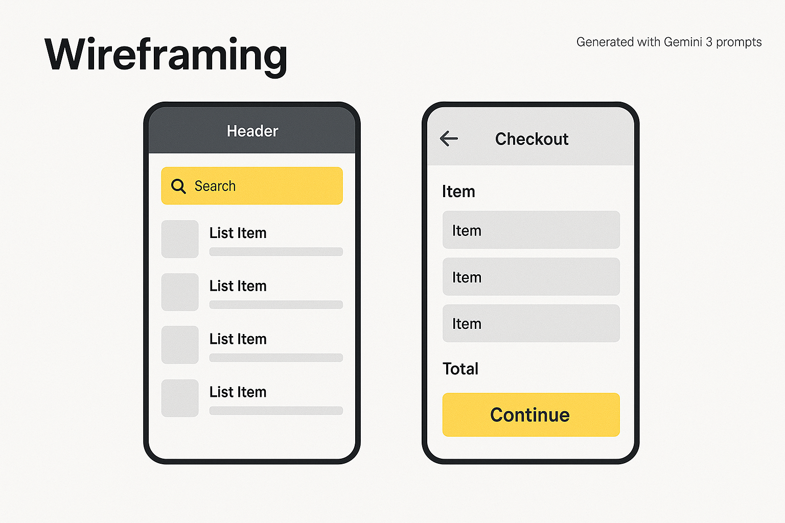
Wireframing examples showing list and checkout screens
Framework: The Consistency Stack
- Tokens first. Define colour, spacing, radius, motion and typography as named tokens.
- Bind tokens to Figma variables and component states.
- Mirror the same tokens in code. One source of truth.
Design system foundations prompts
Role: Design system architect
Ask: Propose a minimal token set for colour, spacing, radius and typography for a neutral brand with an accent yellow. Include a 4‑point spacing scale and WCAG AA contrast pairs. Map tokens to Figma variables and list required component states.
Output: JSON for tokens + table for states + a typography scale with sizes and line‑heights.
Example tokens
{
  "color": {
    "bg": "#ffffff",
    "ink": "#222222",
    "ink-muted": "#555555",
    "line": "#e2e8f0",
    "accent": "#F2FF6C",
    "accent-ink": "#111111"
  },
  "space": {"0":0,"1":4,"2":8,"3":12,"4":16,"6":24,"8":32},
  "radius": {"sm":4, "md":8, "lg":16},
  "type": {
    "family": "Inter, system-ui, Arial",
    "scale": {"xs":12,"sm":14,"md":16,"lg":20,"xl":24,"2xl":32},
    "line": {"xs":18,"sm":20,"md":24,"lg":28,"xl":32,"2xl":40}
  }
}
Map to Figma variables
--colors/bg → color.bg
--colors/ink → color.ink
--colors/accent → color.accent
--space/4 → space.4
--radius/md → radius.md
--type/lg → type.scale.lg
States to include
- Default, hover, pressed, focus‑visible, disabled, error, success.
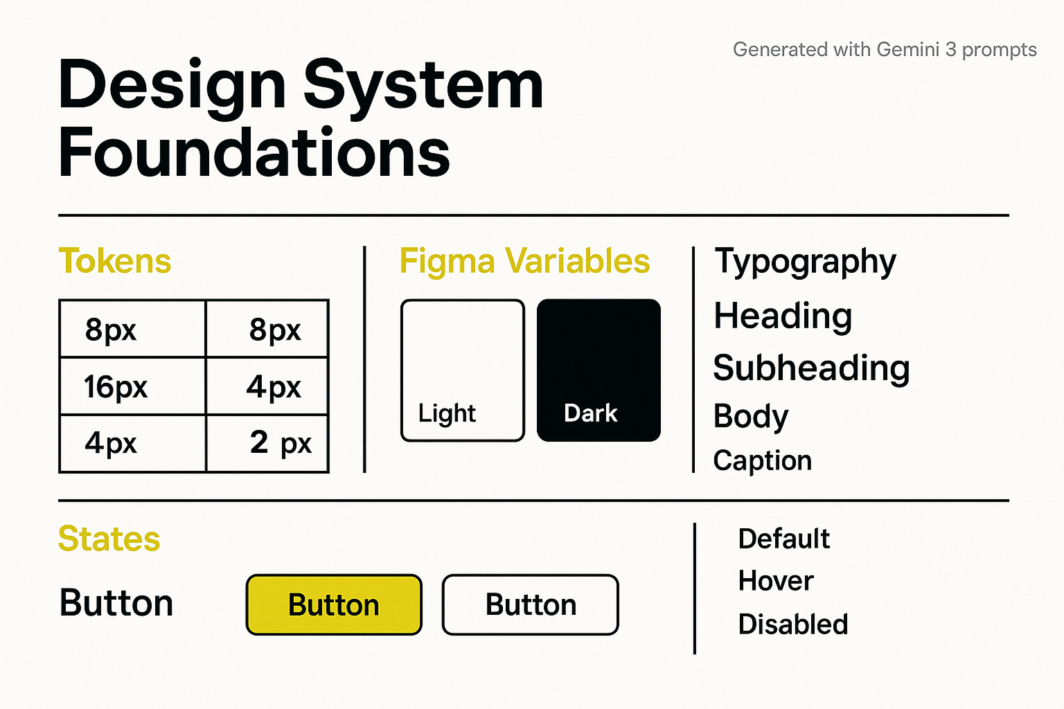
Basic design system foundations board with tokens, variables, typography and states
UI to code
Move from component spec to production code with clear handover prompts. Pair with a linter and unit tests.
UI to code prompts
Role: Design engineer
Ask: Convert this card spec into HTML and CSS with accessible semantics and variables.
Spec: Title, body copy, primary button, 320–1440px responsive, prefers‑reduced‑motion safe, focus outline visible.
Output: Single HTML file with embedded CSS variables using the tokens above. Include alt text attributes on images.
Example output
<div class="card" role="region" aria-labelledby="card-title">
  <h2 id="card-title">Card title</h2>
  <p>Card content goes here. Keep it short.</p>
  <button class="btn-primary">Continue</button>
</div>
:root{--ink:#222;--bg:#fff;--accent:#F2FF6C;--radius:8px;--space:16px}
.card{background:var(--bg);color:var(--ink);border:1px solid #e2e8f0;padding:var(--space);border-radius:var(--radius);}
.btn-primary{background:var(--accent);color:#111;padding:8px 16px;border-radius:8px}
.btn-primary:focus{outline:3px solid #111;outline-offset:2px}
@media (prefers-reduced-motion: reduce){*{animation:none;transition:none}}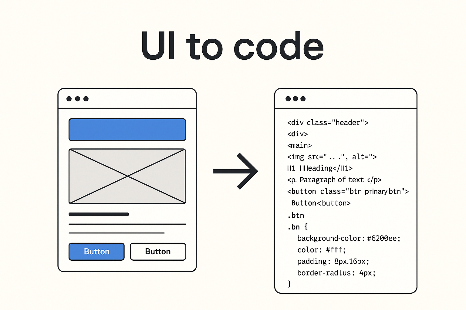
Diagram showing UI wireframe turning into HTML and CSS code
Illustration and photo generation
Use one style brief, one lighting setup and one point of view. Save the seed or style notes so you can repeat it.
Style brief prompt
Role: Brand illustrator
Audience: Product managers and designers
Ask: Create a flat, friendly illustration style with rounded corners, clean lines and high contrast. Avoid decorative fonts. Provide 3 scene prompts that fit onboarding, empty states and success screens. Return hex colours, do and don't rules, and a short alt text template.
Photo generation prompt
Role: Photographer
Ask: Generate diverse studio portraits with soft window light, neutral backdrop, friendly expression, eye level. Return camera settings and a consistent crop for hero images and avatars.
Consistency tips
- Keep palette, line weight and corner radius consistent with tokens.
- Use the same focal length and lighting for photos.
- Write alt text as action + subject + context.
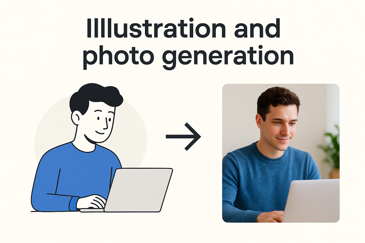
Illustration and photo generation examples turning illustrations into photos.
Accessibility audit
Run a quick automated pass, then a human pass. Gemini 3 can draft an audit report you can share with your team.
Accessibility prompts
Role: Accessibility specialist
Ask: Audit this component library for WCAG 2.2 AA. Check colour contrast, keyboard navigation, focus order, labels, motion and reading level. Return a table of issues with severity, guideline reference and suggested fix text. Produce a short report summary.
Example report excerpt
Overall compliance: 85 percent. Highest impact fixes: increase contrast on secondary buttons, add alt text to 7 images, enable visible focus outlines on menus.
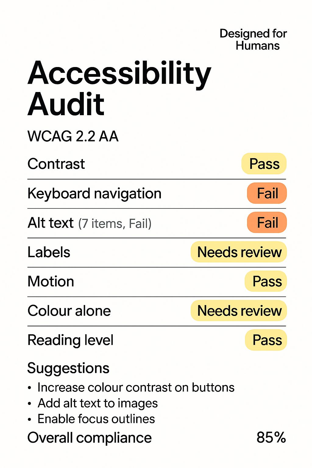
Designed for Humans accessibility audit card with pass, fail and needs review tags
Case studies or proof points
- Retail checkout: Before → handover took 2 days and 3 revisions. During → Prompt‑to‑Prototype loop with tokens in code. After → handover cut to 6 hours and first pass acceptance at 92 percent.
Actionable steps
- Pick one flow. Run the Prompt‑to‑Prototype loop with the wireframing prompt.
- Extract tokens. Mirror them in Figma variables and code.
- Ship a component with the UI‑to‑code prompt. Run the accessibility prompt before release.
Common pitfalls
- Vague prompts. Fix: state role, audience, constraints and outputs.
- Skipping tokens. Fix: name things once, then bind to Figma and code.
Resources
Gemini 3 UI prompt pack
Category: Interface and UX Design
Prompts and use cases for interface and user experience tasks.
| Prompt | Use case |
|---|---|
| Critique the accessibility (WCAG 2.2) of this wireframe. Focus specifically on color contrast and keyboard navigation flow. | UX Review and Auditing |
| Generate 5 alternative icon designs for a 'Share' button, prioritizing clarity and universal recognition across cultures. | Ideation and Visual Design |
| Write microcopy for a form submission error when the user's password is too short. Provide options for 'Friendly' and 'Technical' tones. | Content and Microcopy |
Category: Code and Development
Prompts and use cases for engineering and documentation tasks.
| Prompt | Use case |
|---|---|
| Refactor the following React component to use functional hooks, ensuring the state management is optimized for performance. | Code Refactoring |
| Create a short, well-documented Python function to sanitize user input against common cross-site scripting (XSS) attacks. | Security and; Utility Code |
| Explain the concept of 'memoization' in JavaScript to a junior developer using a relatable analogy. | Education and Explanations |
Category: Strategy and Research
Prompts and use cases for discovery, analysis, and planning.
| Prompt | Use case |
|---|---|
| Develop a research plan to test the usability of a new onboarding flow. Include target audience, methodology, and key metrics. | Research Planning |
| Analyze the competitive landscape for a new productivity application, summarizing the strengths and weaknesses of the top 3 competitors. | Market Analysis |
Token starter JSON
{
  "color": {
    "primary": {
      "value": "#007AFF",
      "description": "The main action color for buttons and links."
    },
    "surface": {
      "light": {
        "value": "#FFFFFF"
      },
      "dark": {
        "value": "#1A1A1A"
      }
    },
    "text": {
      "default": {
        "value": "#333333"
      },
      "inverse": {
        "value": "#FFFFFF"
      }
    }
  },
  "spacing": {
    "xs": {
      "value": "4px"
    },
    "sm": {
      "value": "8px"
    },
    "md": {
      "value": "16px"
    },
    "lg": {
      "value": "24px"
    }
  },
  "typography": {
    "fontFamily": {
      "base": {
        "value": "Inter, sans-serif"
      }
    },
    "fontSize": {
      "body": {
        "value": "16px"
      },
      "heading-1": {
        "value": "2.5rem"
      }
    }
  }
}
Accessibility quick audit checklist
Use this table during design reviews and pre-release checks. Mark Status as Y, N, or NA and capture notes.
| Area | Checkpoint | Status (Y/N/NA) | Notes |
|---|---|---|---|
| Keyboard | Can you use the Tab key to reach every interactive element (links, buttons, form fields)? | ||
| Keyboard | Is the focus indicator (outline) clearly visible on every element as you tab through? | ||
| Keyboard | Can you operate all functions (like dropdowns, modals, or navigation) using only the keyboard (for example, Enter or Space)? | ||
| Visual | Does all non-decorative text have a colour contrast ratio of at least 4.5:1 against the background? | ||
| Visual | Does large text (18pt or 14pt bold) have a colour contrast ratio of at least 3:1? | ||
| Structure | Does the page contain only one visible <h1> heading? | ||
| Structure | Is the heading structure logical (for example, no jump from <h2> to <h4>)? | ||
| Images | Does every informative image have concise, descriptive alternative text (alt attribute)? | ||
| Images | Do purely decorative images have a null alt attribute (alt="")? | ||
| Forms | Does every input field (like a text box or checkbox) have a visible and correctly associated <label>? | ||
| Forms | Are error messages clear, descriptive, and announced by a screen reader (for example, using aria-live)? |
||
| Time/Movement | Is there no content that flashes more than three times per second? | ||
| Time/Movement | Do any time limits (for example, on a login screen) offer the user a way to extend or disable the limit? | ||
| General | Does the site pass a browser zoom test (can you zoom to 200% without losing content or causing horizontal scrolling)? |
FAQs
-
No. It speeds up creation and enforcement. Humans still set strategy, taste and ethics.
-
Treat it like a strong starter. Lint, test and review before merging.
-
Save a style brief and reuse the same tokens, seed notes and component states.
Final answer
Yes. Gemini 3 can speed up UI design without sacrificing quality when you use structure. Start with wireframes, give your design system a single vocabulary of tokens, and mirror it in code. Add consistent visuals and run a short accessibility audit before you ship. The prompts and examples here are ready for your next sprint.
Use cases at a glance
A quick comparison of the five Gemini 3 UI design tasks and the outputs you should expect.
| Use case | What to ask | Outputs | Checks |
|---|---|---|---|
| Wireframing | 3 alternatives + annotations | Screen list, components, edge cases | Coverage, clarity, empty states |
| Design system foundations | Tokens, variables, states | JSON tokens, typography scale | Contrast pairs, state completeness |
| UI to code | Accessible HTML and CSS | Responsive component markup | Lints pass, visible focus, tests |
| Illustration and photo | Style brief + scenes | Illustrations, portraits, alt text | Consistency with tokens, diversity |
| Accessibility audit | WCAG 2.2 AA review | Issue table + summary | Highest impact fixes prioritised |
Further reading

How do you ‘Make’ like a pro with Figma Make for smarter AI-powered prototyping?
From code to conscience: Why Edinburgh’s AI boom must put people first.

Innovating digital products for real humans — our approach.
Free EAA action plan — prepare for accessibility law.

Free consultation
We partner with you to accelerate and create a design system that blends seamlessly into your workflow and brand.
External references
WCAG 2.2 guidelines: https://www.w3.org/TR/WCAG22/
WAI-ARIA Authoring Practices: https://www.w3.org/WAI/ARIA/apg/
Figma variables documentation: https://help.figma.com/hc/en-us/articles/15339657135383-Guide-to-variables-in-Figma
W3C Making Content Usable for People with Cognitive and Learning Disabilities: https://www.w3.org/TR/coga-usable/
Prompt design strategies (Google AI): https://ai.google.dev/gemini-api/docs/prompting-strategies
Prompting intro: zero-shot vs few-shot, context, parameters: https://ai.google.dev/gemini-api/docs/prompting-intro
System instructions and best practices: https://ai.google.dev/gemini-api/docs/system-instructions
Prompt gallery with copyable examples: https://ai.google.dev/prompt-gallery
Google AI Studio overview for trying prompts fast: https://ai.google.dev/aistudio/
DeepLearning.AI x OpenAI short course: ChatGPT Prompt Engineering for Developers: https://www.deeplearning.ai/short-courses/chatgpt-prompt-engineering-for-developers/