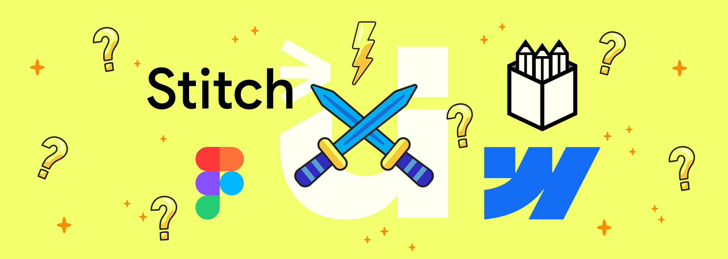
Clash of the UX Titans: Stitch vs Figma vs Penpot vs Webflow
Or, what to use when you’re building big things with limited patience.
Comparing modern UX tools
🧵 Google Stitch – “Designers, meet code. Code, meet design.”
What it wants to be:
A radical rethink — live components, AI assistance, and no more handoffs.
Vibe:
Experimental, bold, and full of promise. Like working inside a Figma file that breathes.
Where it shines:
• Real-time behaviour with actual data (not just pretend scrolls and buttons)
• AI-powered layout generation — sketch with words, not wireframes
• Export to both Figma and real code
• Custom themes with serious control
Where it might wobble:
• It’s still in its early days — expect hiccups
• Teams heavily embedded in Figma might find it disruptive
• May not (yet) be suited to production-ready enterprise work
Ideal for:
Product teams that want speed, designers who want more control, and devs who are over the old ‘design wall toss’.
🎨 Figma – “The industry standard with plugins for days.”
What it wants to be:
The single source of design truth.
Vibe:
Polished, professional, highly collaborative — a digital whiteboard with structure.
Where it shines:
• Multiplayer collaboration is seamless
• A massive ecosystem of plugins and templates
• Auto layout, components, variants — it’s all there
• Dev mode bridges the gap (kind of)
Where it gets frustrating:
• It’s not live — no real data or dynamic interaction baked in
• You still need devs to translate everything
• Plugin fatigue — sometimes the basics require five add-ons
Ideal for:
Designers and product teams who need control, structure, and stability — and aren’t afraid to do the dev handoff dance.
🖌️ Penpot – “Open source, open standards, open minds.”
What it wants to be:
Figma… but freer.
Vibe:
Principled, community-driven, still finding its rhythm.
Where it shines:
• Entirely open-source — ideal for privacy-focused orgs
• Works for devs and designers without vendor lock-in
• Component system is steadily improving
• SVG-based architecture = great for accessibility
Where it’s rough:
• UX isn’t as buttery as Figma (yet)
• Dev handoff tools aren’t as evolved
• Collaboration is there, but feels a bit clunky in comparison
Ideal for:
Teams with a strong open-source ethos, or orgs with strict self-hosting/privacy needs.
🌐 Webflow – “Design visually, build for real.”
What it wants to be:
No-code (and low-code) web development made beautiful.
Vibe:
Slick, commercial, and very production-focused.
Where it shines:
• You’re building live websites, not just mockups
• Incredible control over interactions and animations
• Hosting, CMS, e-commerce — it’s a whole platform
• Great for freelancers and agencies with deliverables due yesterday
Where it bites back:
• The UI is intense — lots of tabs and jargon
• Not ideal for teams with separate designers and developers
• Pricing adds up fast, especially for multiple projects
Ideal for:
Entrepreneurs, solo makers, and marketers who want stunning results without wrangling code.
⚖️ So… which one’s right for you? Each of these has a different philosophy, and that’s where the real decision lies:
Tool
Best for
Code-curious designers & fast-moving product teams. Describe your product flow and get AI to design it.
The current industry standard. Collaborative design, white boarding, social media and websites with lots of plug-ins
Privacy-conscious orgs & open-source purists. With components and design tokens.
Create and publish React-based websites without loosing creativity.
🪡 Final stitch in the fabric
If we had to make a provocative prediction?
Stitch could be the start of the end for the traditional design → dev split. It’s not perfect, but it’s poking all the right pain points. And if it evolves steadily (without getting tangled in its own ambition), it might become the place where great digital products are born — collaboratively, creatively, and without the bottlenecks.
However, you could be limited to ‘standard’ interfaces that are not unique and don’t understand your business.
But the question is: are we ready to let go of our sacred design/development silos?
We’ve partnered with Design Rush to feature in the top UI and UX agencies in the UK.
Whichever tool you use, Designed for Humans is here to make it resonate and work for real humans.
Curious about UX and design?
Take a look at our other blogs