Why so many start-ups struggle with simple and how to get it right
When you're building your first product or gearing up for launch, one piece of advice is always relevant: “Just make it simple.”
Sounds easy, right? But in reality, simplicity is one of the hardest things to design, especially when you’re a start-up trying to prove value, ship fast, and impress investors.
At Designed for Humans, we’ve worked with dozens of teams navigating this exact moment: tight timelines, limited resources, and the huge pressure to get it right, and more often than not, the thing getting in their way isn’t lack of features, it’s too many of them.
Let’s unpack why simplicity is such a challenge and how to design for it when your start-up’s reputation (and funding round) depends on it.
Simple ≠ Minimal
One of the biggest traps early-stage teams fall into is mistaking minimal for clear. Removing buttons, stripping text, or hiding complexity can make things look clean, but that doesn’t mean it’s easy for users to understand or use. True simplicity isn’t about removing stuff, it’s about removing the right stuff. You don’t want to create something that looks sleek but leaves people wondering: “What do I do next?”
💡 So, what does help?
Here’s what we’ve seen work time and time again with start-ups we support:
Start with jobs to be done, not features. Focus on the outcomes your users want to achieve. Strip your onboarding, interface, and copy back to that core job. Want people to invite teammates? Don’t bury it behind five tabs. Make it front and centre.
Don't design for parity, design for purpose. We get it: your competitor has 12 dashboards and 17 settings toggles. That doesn’t mean you need them. Feature parity might look good in a pitch deck, but bloat kills clarity. Build for product-market fit, not comparison charts.
Ask what they’d remove. Instead of just asking users what features they want, flip the script. Ask what feels unnecessary. What gets in the way? You'll be amazed at what can go — and how much smoother the experience becomes.
Clarity > cleverness. Clever animations, slick carousels, or abstract icons might impress your design friends, but if users don’t immediately “get it,” you’ve lost them. Early users especially need clarity, fast.
🛠️ How Designed for Humans helps start-ups cut through
We help early-stage teams:
Identify the real user goals through UX research and user interviews
Simplify products through journey mapping, feature prioritisation, and rapid prototyping
Design MVPs and go-to-market experiences that are accessible, intuitive, and built for growth
Craft clear messaging and landing pages that explain your value in seconds, not scrolls
Build pitch decks and product narratives that help you win user trust and investor attention.
🚀 Tip for your next sprint
Before adding that new feature to your backlog, ask: “If we didn’t build this, what would happen?” If the answer is “not much,” it’s probably not worth it.
🎤 Final thought
Simplicity isn’t the absence of complexity. It’s the result of courageous choices. Start-ups that simplify well don’t just make things easier to use — they make themselves easier to trust, invest in, and grow.
Ready to simplify your product and supercharge your go-to-market? Let’s make it clear, not cluttered.
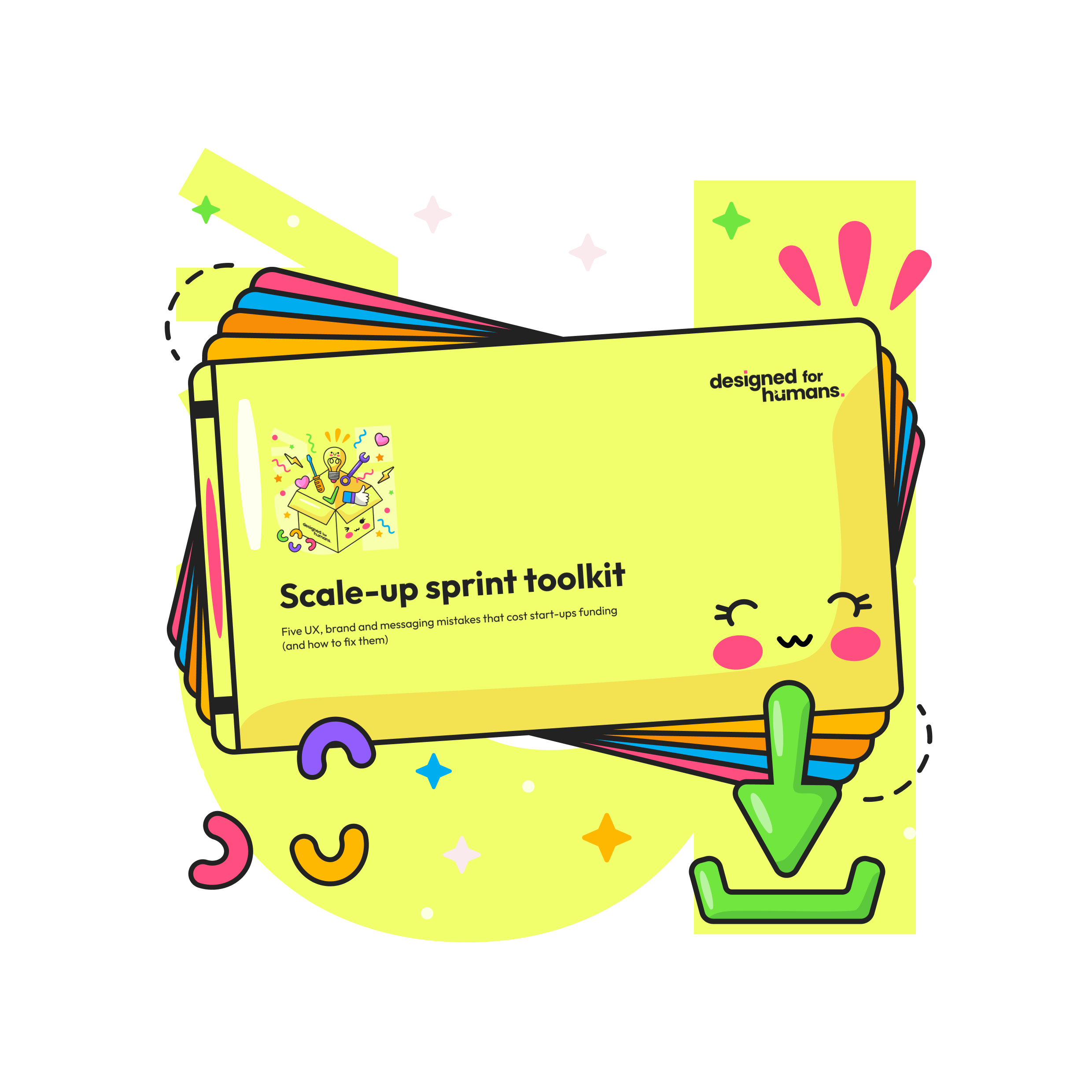
Free download
Scale-up sprint toolkit
Designed for Humans is here to make your UX resonate and work for real humans.
Curious about UX and design?
Take a look at our other blogs